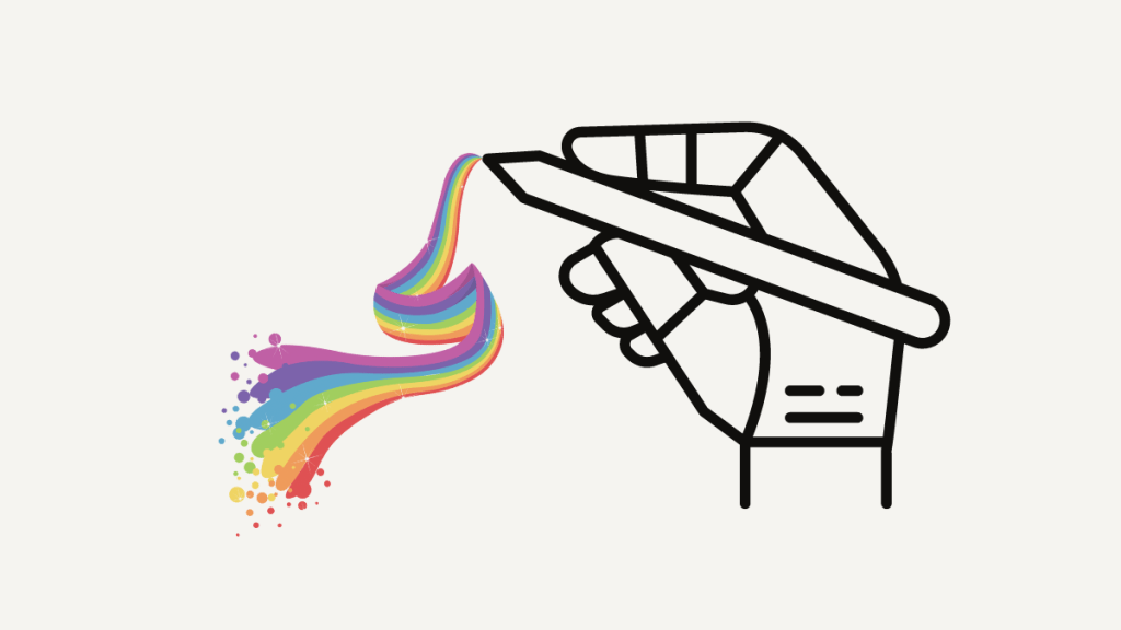
It’s something that arguably is going to be taken over by AI in the not-too-distant future, but the discerning human eye will always be needed to finetune things. Or so I believe. This post is about the various aspects of design I have been playing with alongside AI to determine the current possibilities.
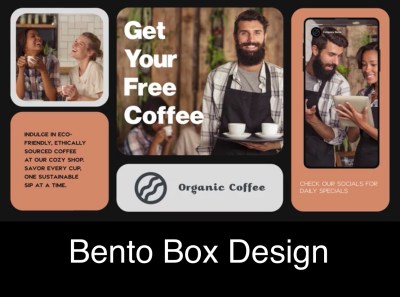
From a pure design point of view, I love the Bento Box Design approach. It may be targeted at social media use, but I think it can work in many channels.
I am trying to replicate it here in WordPress in this post. I actually got the idea from a video on YouTube.
Check out the video on the CSS Grid Builder, the tool I used for the design below. I also used the AI Assistant Block in WordPress – none of the text is mine.
Why Design?
Good design is crucial as it enhances user experience, captures attention, and communicates messages effectively. It can elevate a product or service, differentiate it from competitors, and ultimately lead to increased engagement and satisfaction.
Additionally, good design has the power to simplify complex information, establish brand identity, and evoke emotional connections with the audience, fostering long-lasting relationships. Overall, it can significantly impact the success and perception of any project or initiative.
Design is not just what it looks like and feels like. Design is how it works. – Steve Jobs
Essential Design elements
- Balance: The distribution of elements within a design should create a sense of harmony and stability.
- Hierarchy: Organizing elements in order of importance, guiding the viewer’s eye and conveying the intended message clearly.
- Contrast: Using differences in color, size, and shape to create visual interest and highlight key elements.
- Repetition: Consistent use of fonts, colors, and graphic elements to establish a cohesive and unified design.
- Alignment: Ensuring that every element has a visual connection with another, creating a cleaner, more cohesive design.
- Space: Effective use of space to enhance readability and focus, giving elements room to breathe within the design.
Adventures inside Organisations and Mind
Design for Impact
I’m not saying the above design is perfect, far from it. But it was pretty easy to create so let me try capture the advantages of this process and outcome:
- It was easy, I mostly just followed the instructions in the video and that’s it.
- The content (text and images) are in the page, or post rather, and didn’t require a designing tool per se, like PhotoShop, Canva, PowerPoint, etc. This means I can edit it easily later if needed by just editing the post. This also means the content is all indexable by search engines.
- I could work with the design alongside other content in the post, just like I am adding extra text here.
- This design can be saved as a pattern and synced across many pages – more about that here: Create a Pattern.
- It’s responsive and works on multiple screen sizes, unlike a static image would behave.
As communications and design become more and more important in a cluttered, over saturated world, with AI exacerbating that, I think cutting through with impactful messaging becomes more and more important.
Video is the next frontier that I’ll be exploring. And I will endeavour to use AI to explore this entire challenge wherever possible.

Leave a Reply