
They get bandied about and poured over as if they were the ultimate truth. They are just a proxy for value. They are a precursor to it, no doubt, i.e. you need to have adoption before you can get to value outcomes. But they are not the end goal.
They don’t provide leading indicators that can predict future outcomes, allowing for proactive adjustments. In fact, often you see adoption taper off after initial spurts. The newness wears off and when there is no perceived value, users don’t come back. Unless usage or engagement is again inflated by mandate or through artificial means.
Adoption metrics can provide lagging indicators, reflecting past performance, helping assess success and shape long-term strategy. So they do have some value.
But here is the critical challenge.
Correlation and Causation
This is a sticky problem that has confounded scientists for many years – well explained here: If ‘correlation doesn’t imply causation,’ how do scientists figure out why things happen?
If its hard in Science, imagine how hard with technology adoption. How do you verifiably attribute adoption to business outcomes? That is the quandary.
I don’t have hard solutions but think I have better approaches. It lies in mapping adoption data to business impact data (KPI’s) in the right ways.
Experimentation and Storytelling
In my work with customers I advocate data drive experimentation and reporting. Start with finding the right data sources and mapping it to the right metrics.
For example, if sales data is where you want to show the impact of AI based technology adoption, are you measuring the current metric you’d like to show impact on. If yes and you have the source of the data, the next trick is to map it to the right adoption related data. In the right tool.
At Microsoft where I work (disclosure), we use a tool explained here: Copilot Business Impact report.
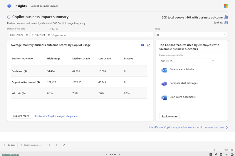
With this tool, you can upload your business performance data and map it to adoption data. Above is an example screenshot from the tool showing business outcome results based on different levels of adoption.
If you split users into separate groups so that each group experiences a different condition (e.g., treatment vs. control) then you can compare the outcomes across groups to see if the differences are meaningful.
Knowing everything is too much like knowing nothing; without a story, it’s all just information.
Jennifer Egan
Telling the right story around the data is the next task. But I’ll leave that for another post.

Leave a Reply